Most Food Relief Runs on Assumptions Nobody Wrote Down
June 25, 2026
Ask three people who plan food relief in the same county where the gaps are, and you will usually get three confident, different answers. One points to a rural township. Another to a neighborhood near downtown. A third to wherever the last hard phone call came from. Each answer is grounded in real experience. None of them is written down, compared, or checked. The shared picture of where need and coverage actually diverge lives in people's heads, and it leaves the building when they do.
That is the ordinary condition of food access planning in most regions. It is also what makes a quiet project out of Missouri worth paying attention to.
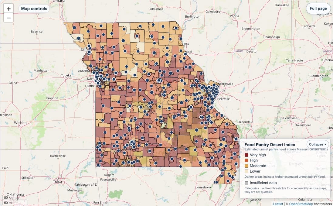
Researchers at Washington University in St. Louis, with support from the Weidenbaum Center, built a statewide planning map that does something deceptively simple. It estimates how many food-insecure adults live outside reasonable reach of a pantry, tract by tract, and sorts each area into a four-level rating of unmet need. The estimate combines federal food insecurity data with population counts, then models which areas fall within a mile of a mapped pantry. The result is a single, public, statewide view of where access most likely falls short.
The map itself is useful. But the map is not the part worth copying. The disciplines behind it are.
Three things Missouri made explicit
First, they wrote down what "access" means. The project publishes its coverage rule, its rating cutoffs, and its underlying data files. Anyone can see that a "desert" here means a certain count of food-insecure adults outside a one-mile radius, and anyone can argue with that choice. Most regional planning never reaches this point. The definition of a gap stays implicit, which means it can never be debated, improved, or agreed on.
Second, they separated the screening question from the operational one. The tool is built to answer "where should we look first," and it refuses to pretend it answers "what is happening on the ground today." The authors are direct that it does not capture a pantry's current hours, capacity, inventory, or staffing, and that straight-line distance is not the same as travel time or transportation access. That restraint is not a weakness. It is what keeps the tool honest and keeps users from over-trusting a model.
Third, they treated it as shared infrastructure rather than a private asset. It is university-supported, openly documented, and downloadable. No single organization owns the picture. That is the difference between a coordination tool and a competitive one.
The catch, which is the whole point
A map like this is a starting point, not an answer. It can tell you a township is likely underserved. It cannot tell you that the one pantry there is open six hours a week, run by a volunteer in her seventies, and turning people away by Wednesday. That knowledge lives with people, in the network, in real time. The Missouri team says as much: pair the map with local verification before acting on it.
That caveat is not a footnote. It is the reason the model is replicable rather than a finished product to license. The map does the part that is hard to do informally, which is hold a transparent, regional picture in one place. The people doing the work do the part a map can never do, which is know what is actually true this week. Neither substitutes for the other.
What this means for foundations
Community foundations fund a great deal of food relief. They fund far less of the connective tissue that would let them see whether that relief is reaching the places that need it most. Missouri shows what that connective tissue can look like, and that it is fundable, replicable, and largely absent in most regions.
The invitation is not to admire someone else's map. It is to ask an uncomfortable question about your own region: if you had to show, on one screen, where need and coverage diverge across every organization you support, could you? If the honest answer is no, the gap is not a lack of effort. It is a lack of shared, explicit infrastructure. Missouri decided to build it. The rest of us can decide to copy it.
Source: the Food Pantry Desert Map, part of the Missouri Food Pantry Maps project from the Weidenbaum Center on the Economy, Government, and Public Policy at Washington University in St. Louis. foodpantrydeserts.org